
PROBLEM
Create a matching printed poster series of advertisements for the Yerba Buena Center for the Arts in San Francisco. Use predominantly similar type handling and design elements to make them look cohesive, differentiating only for each section of the organization. The 10 x 15 posters must maintain an identical grid structure, and similar typographic treatment throughout.
SOLUTION
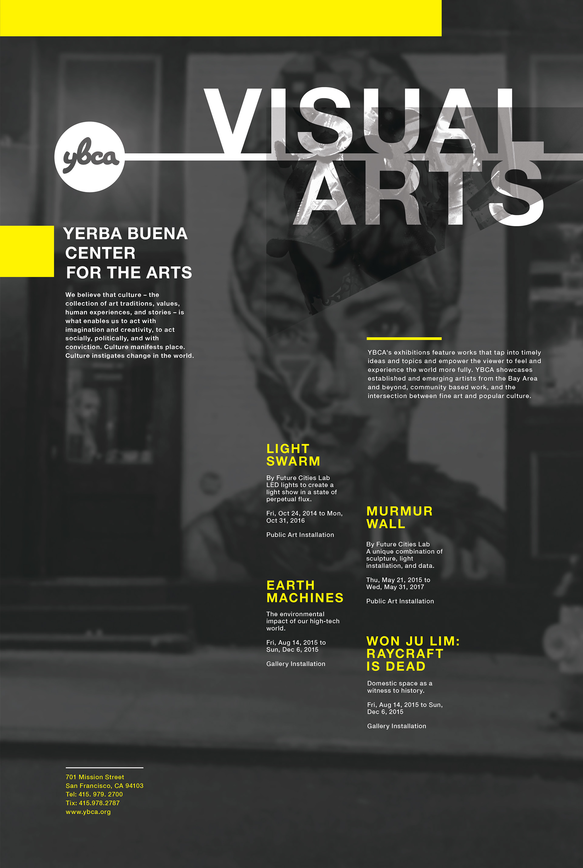
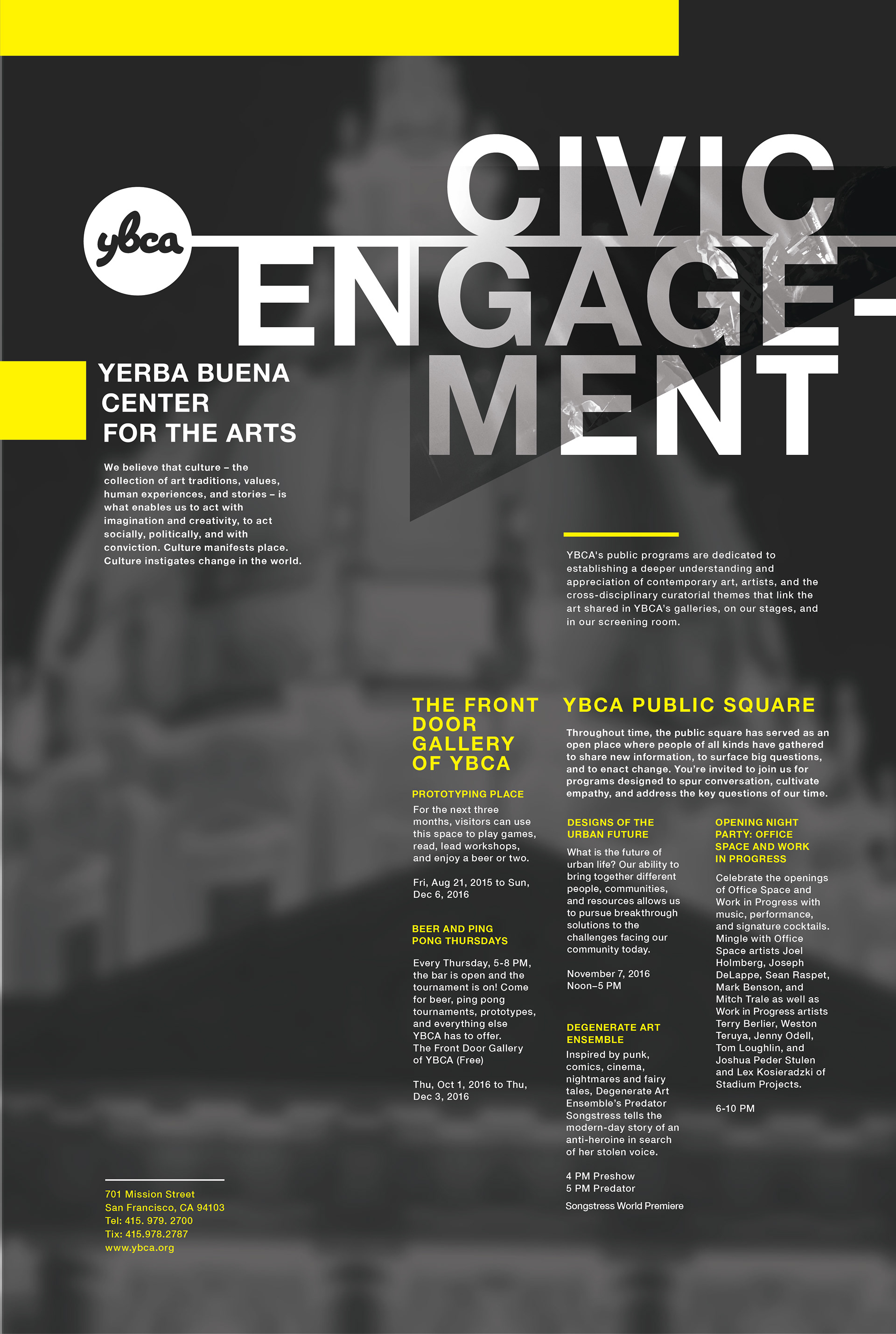
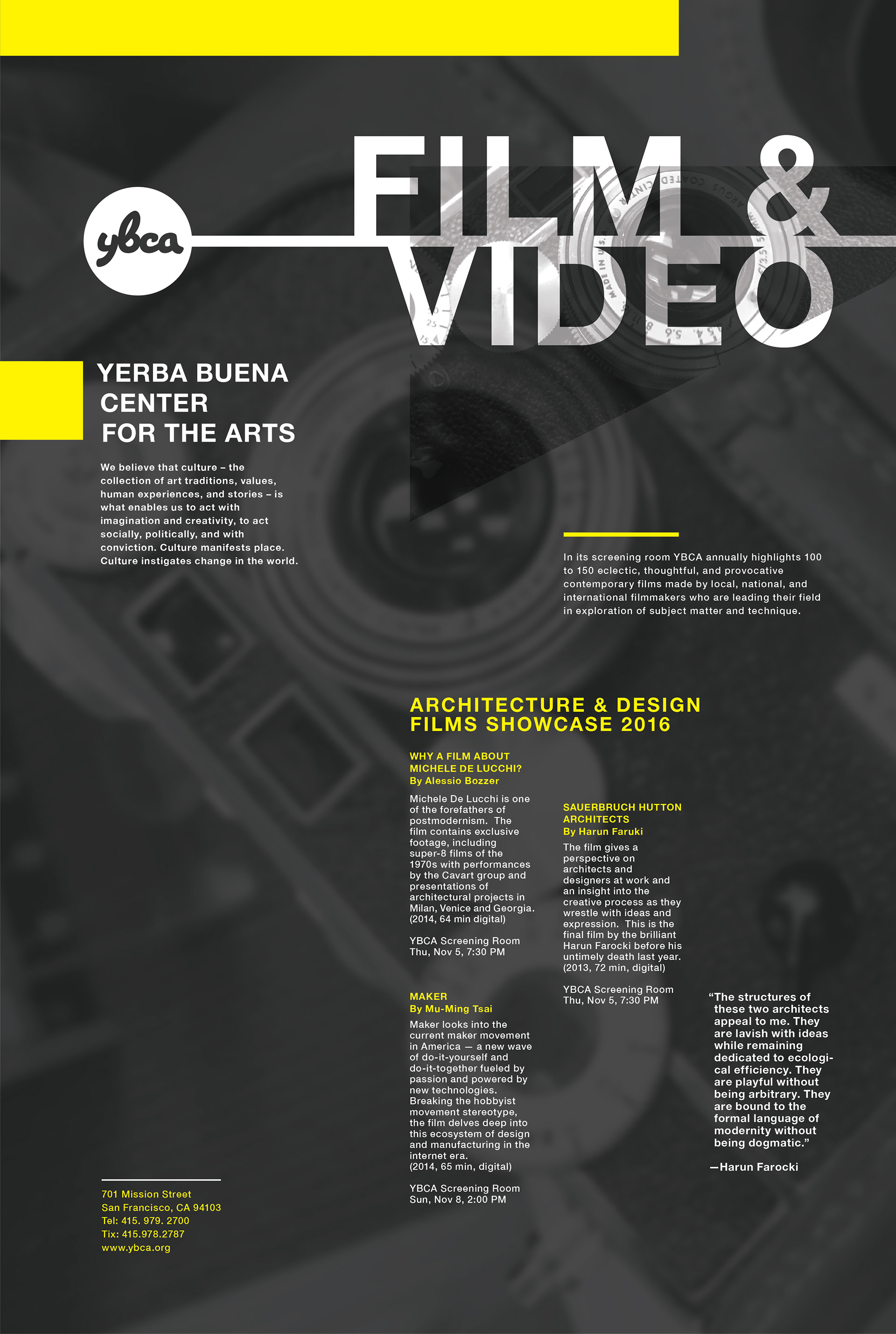
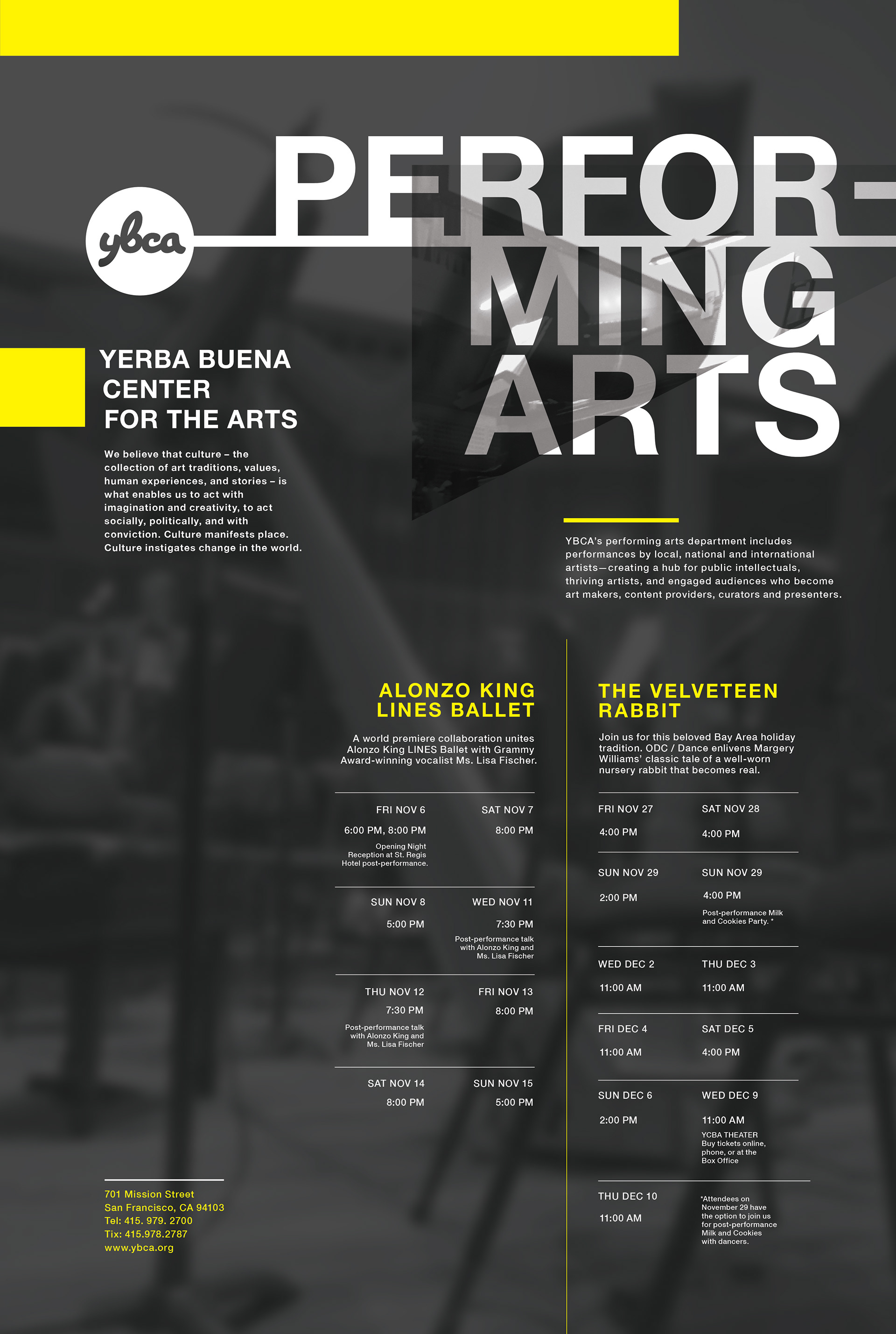
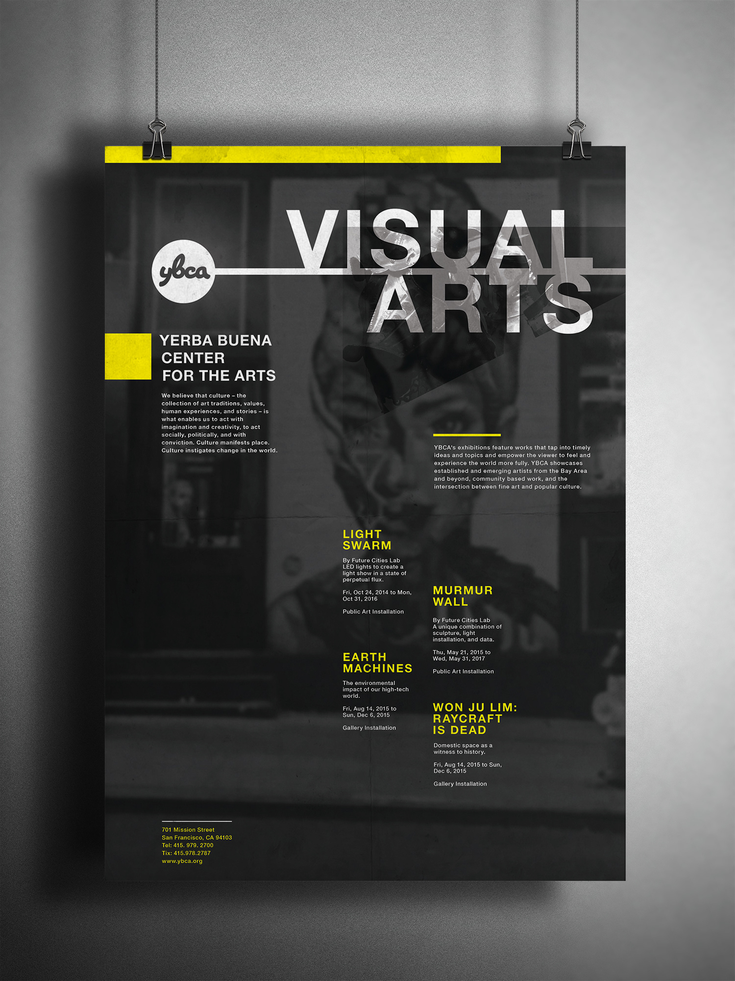
For the YBCA, I chose to organize the information according to its relevance and similarity. Each exhibition and section of the YBCA has its own nuances and demand for aesthetic. I wanted the complex overlays of imagery to drive the compositions, while keeping headlines apparent from past 15 -20 feet away. I used the short bursts of body copy to provide visual texture over the background and secondary images, in a sense the informaton retained its legibility but was still visually appealing. This means the posters were readable from many ranges, like across the street for example.