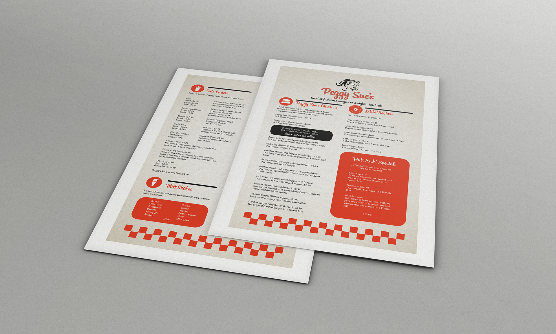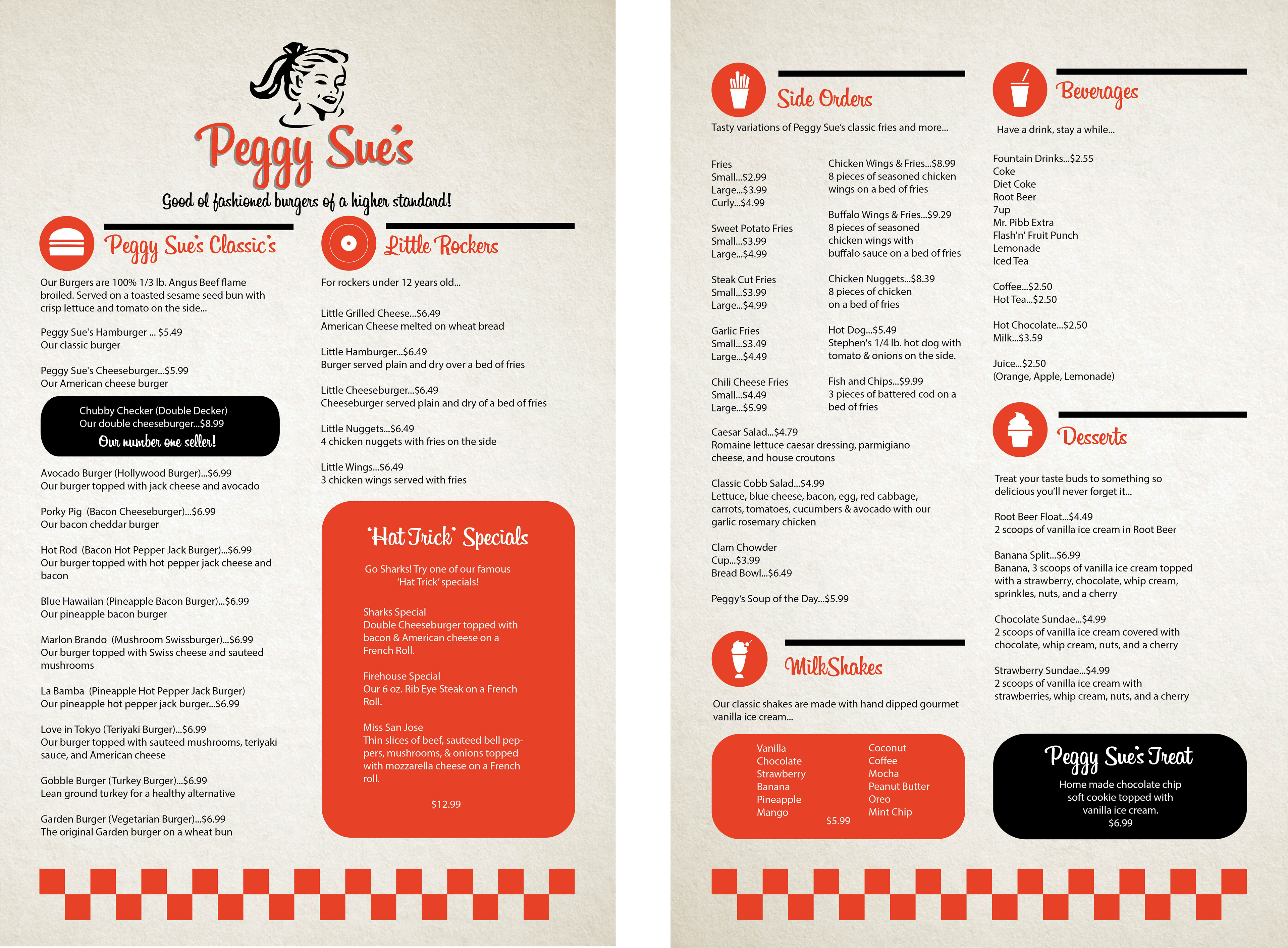

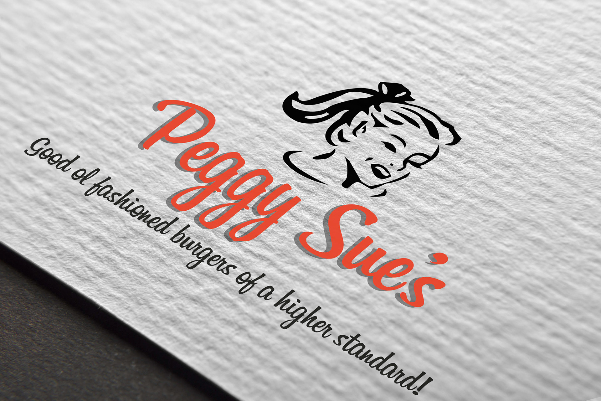
PROBLEM
The goal for this project was to redesign an identity, and create a high end feeling menu for a local restaurant, rebranding the company’s current design language.
SOLUTION
Keeping part of the established branding, a classic feel was implemented, and a minimized layout was used as well, contributing to the overall simplified look. Peggy Sue’s, a local Downtown San Jose establishment was the target, with its underdeveloped potential for a great aesthetic. The menu’s personality was accomplished with well known marks of the era, such as the graphic bars and checkers lining at the bottom. The icons work to tie the colors together in a uniform way. From the texture to the text, the menu is meant to be fun, and classic.