
PROBLEM
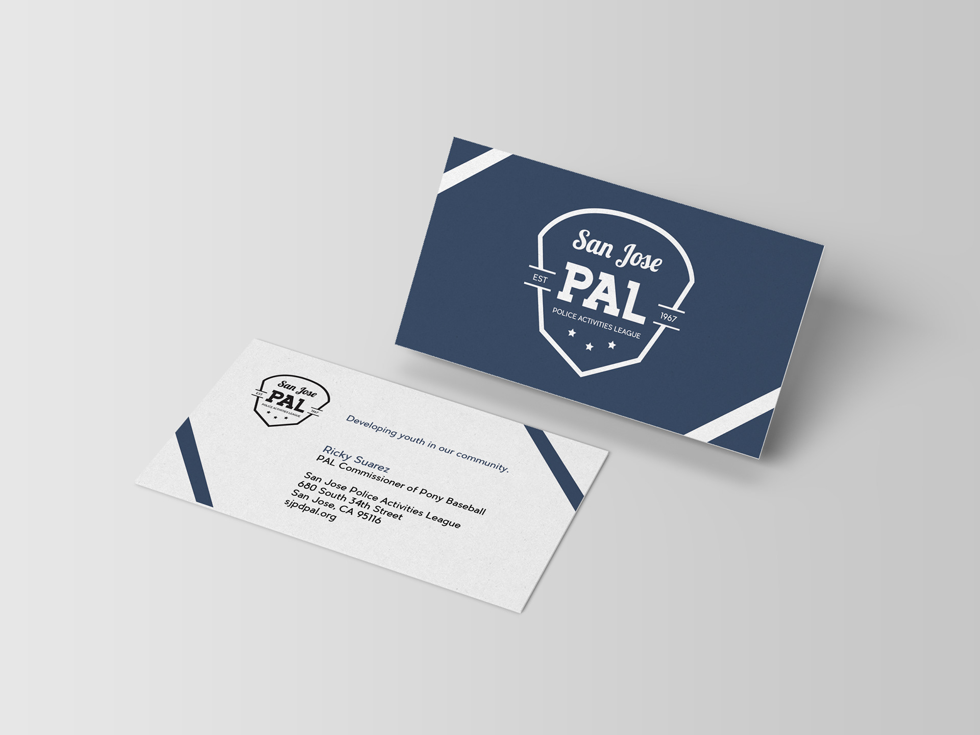
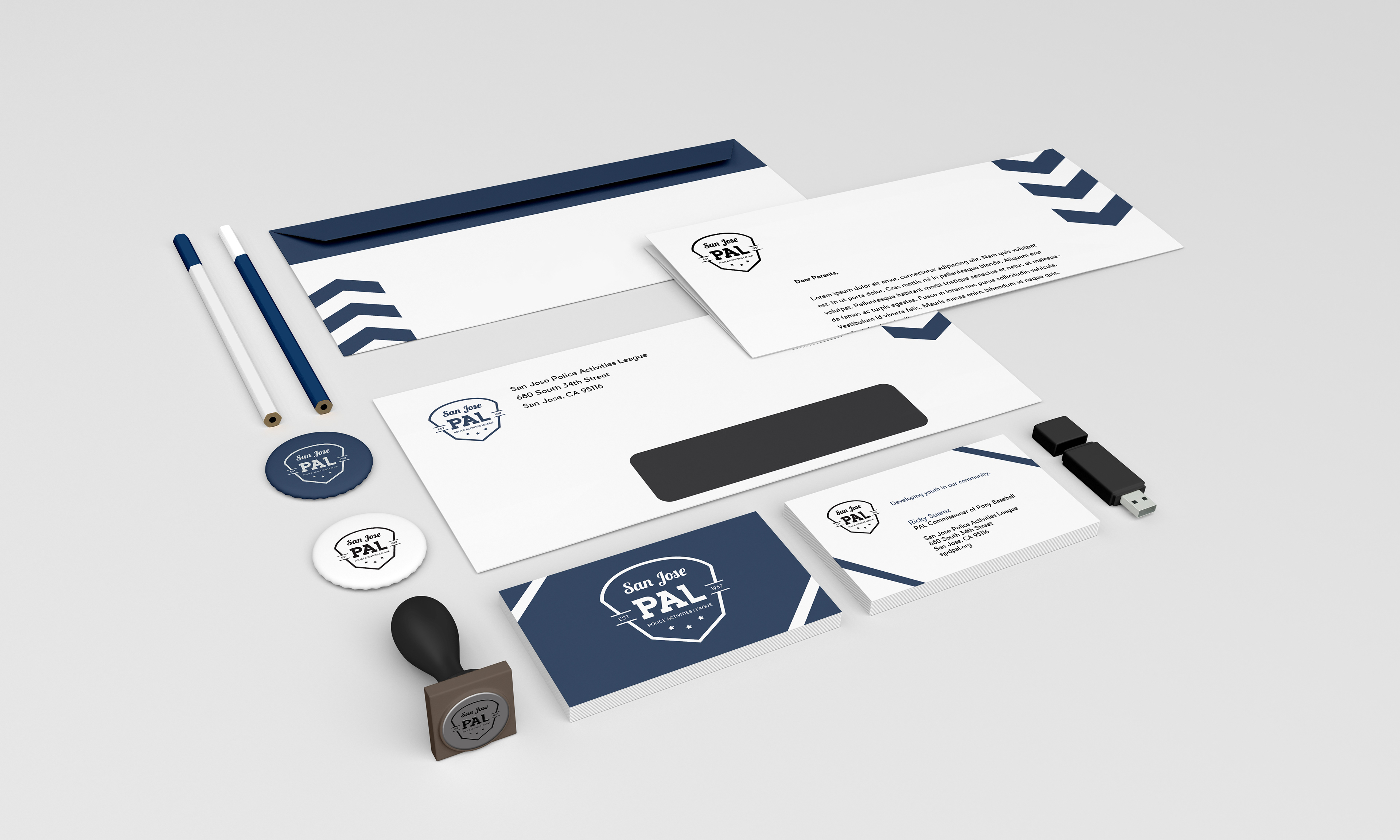
This project was a complete rebranding of a non-profit organization, replacing their current image in favor of a more uniform and fitting design. Using newly established branding, color and type systems, I implemented a collateral identity kit, and sampled content to create mock advertisements as well.
SOLUTION
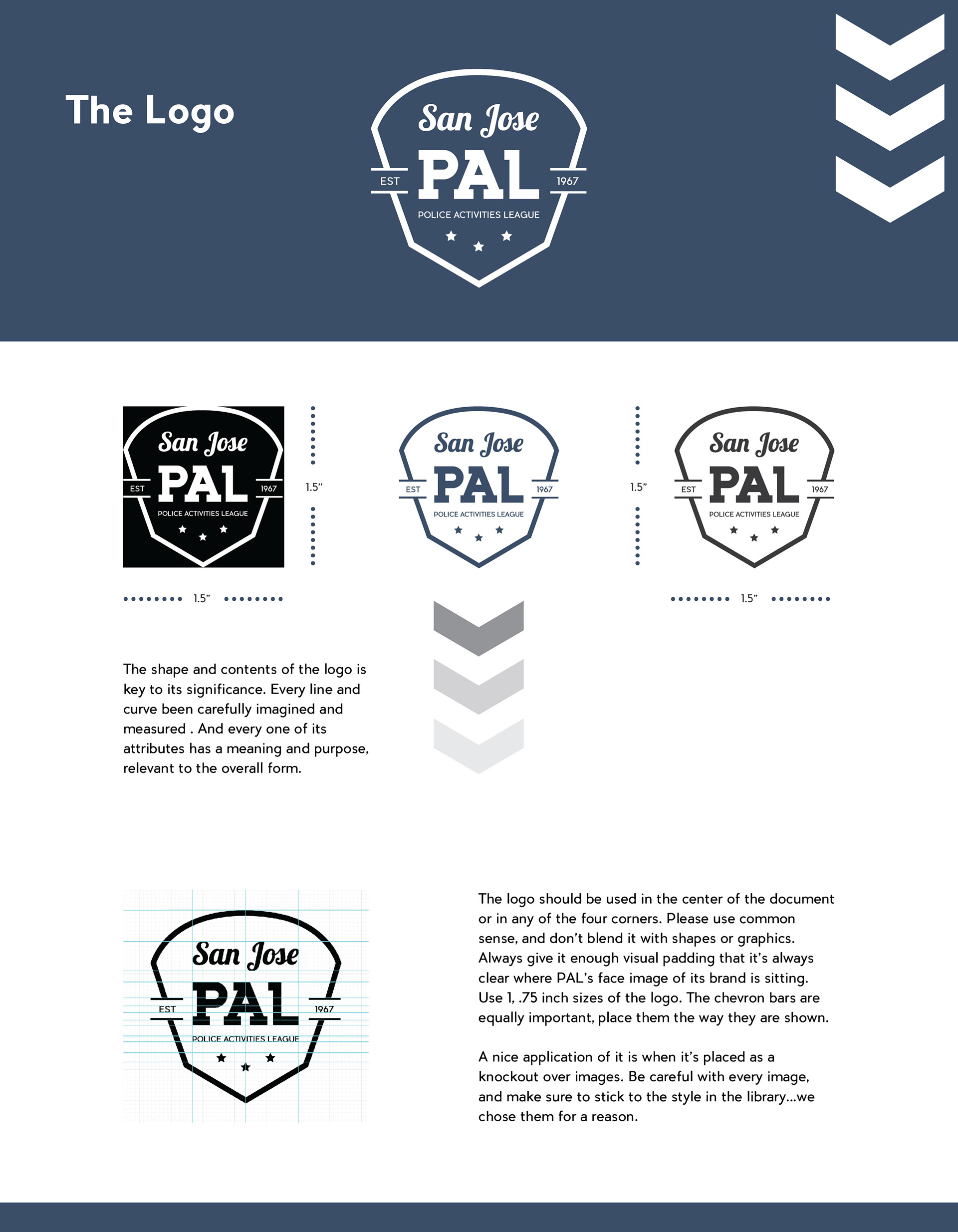
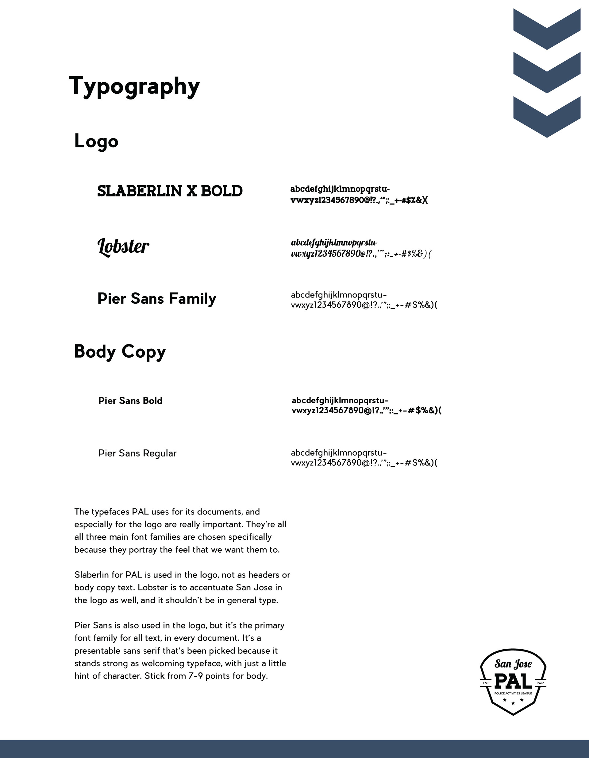
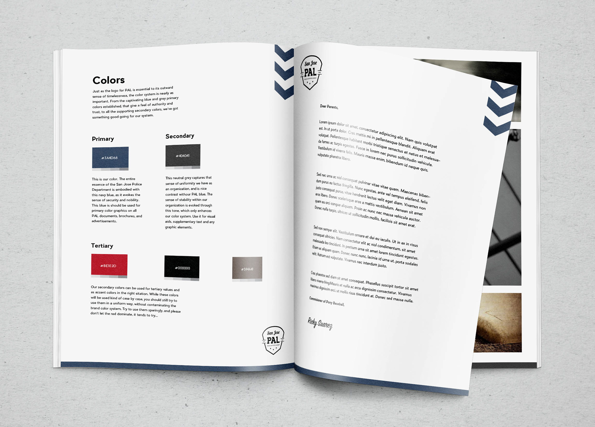
The style guide began with a reboot of the current logo. From there, the document was put together in pieces, from the color system, type treatment guides, imagery, a grid system, and graphical devices used to pull the all parts of the document towards a central uniformity. I wanted to keep a classy feel going to make the company look centered around the idea of honoring the sports, and police that are at the organization’s core in support. Indirect and often subtle hints toward that established feel came through with devices such as the chevrons, color tones, choice of primary and secondary colors, and subliminal messaging.
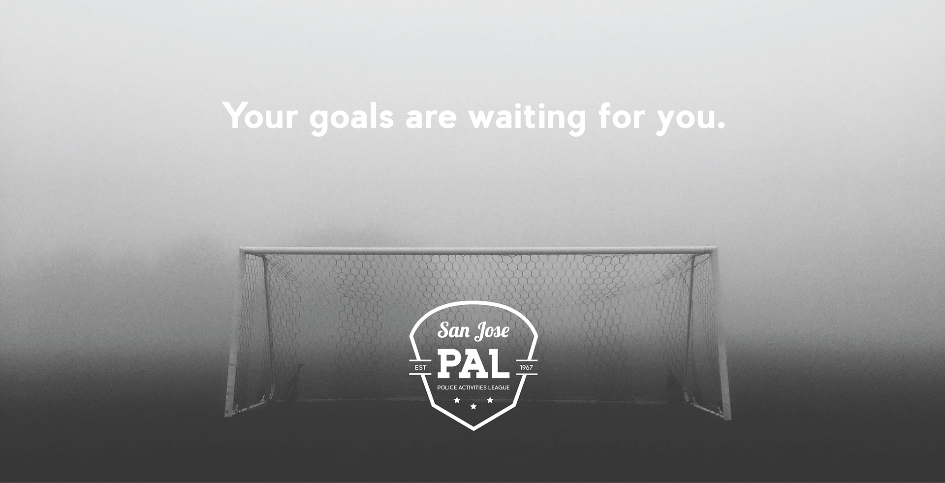
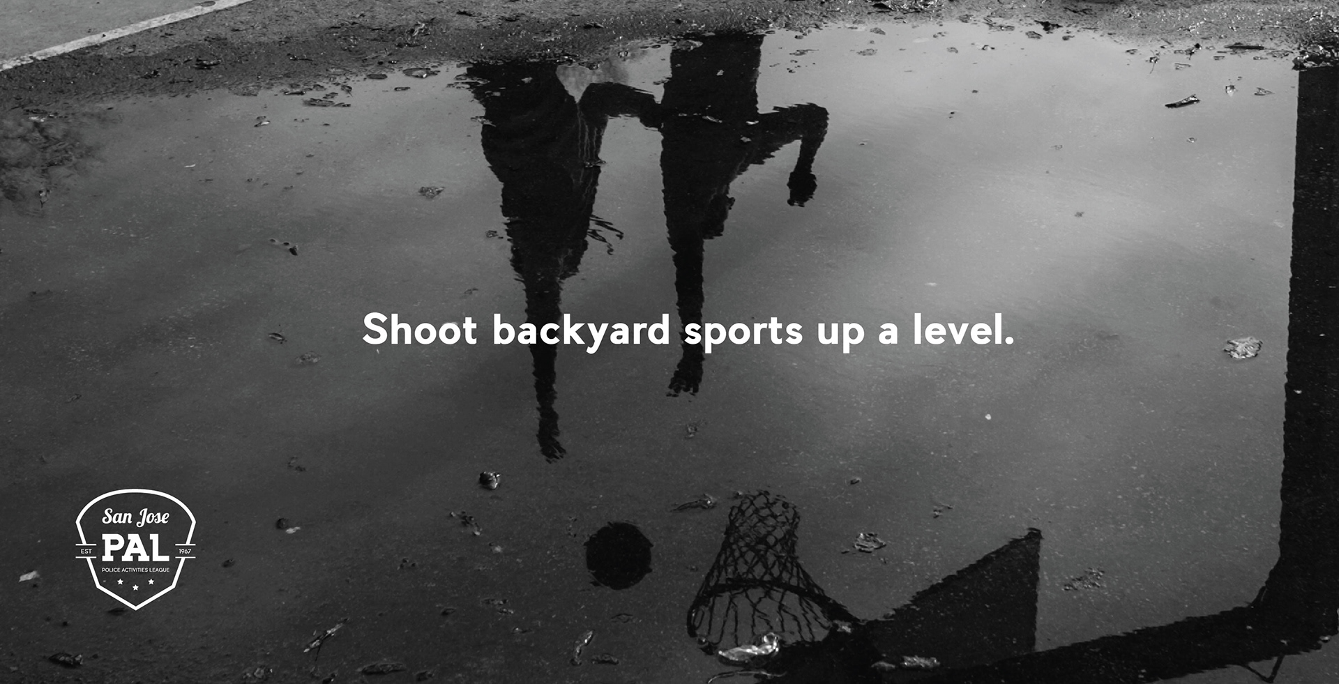
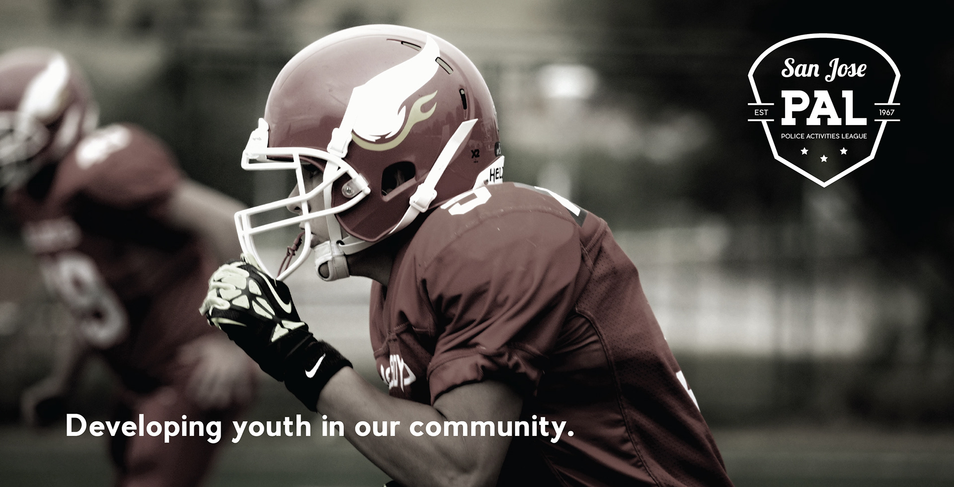
Billboard Designs